

POTTERY CORNER
Brand Refresh
Brief:
To update the pottery shops leaflets.
Solution:
Like all my projects I had a consultation with Mauro where we discussed all his requirements and any initial ideas he had. From this I then went and wrote all the copy to be included into the leaflets.
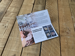
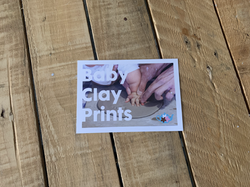
The baby clay prints flyer is a hand out to potential new customers who come into enquire about having them done, so it was key we had a notes area. The larger leaflet main job is to be a shop window to show customers all the available services and again, set the tone for the pottery studio. The client had a collection of lovely photographs from over the years, which was a great asset for updating the leaflets.
The brief was to keep the sizes of the leaflets the same as the originals. However I know the client wanted the larger one to feel different, so I mocked up an idea of using the roll fold leaflet landscape instead of portrait. I think this was a great twist and it broke the mould on a simple folded leaflet.
For the cover of the two leaflets we agreed upon a large cropped image concentrating on hands creating. I didn’t want to focus on completed work as it was all about you the customer creating with their own hands so it felt like the perfect way to show this. I used a bold font with a simple title for both leaflets for consistency so it was clear you could tell it was the same company communicating to you. The large leaflet is sectioned so there is an area to explain the different services in nice, clear, minimal text with no waffle but a warm tone. The smaller leaflet was a simple 2 column showing the finished product when it was framed.
I opted to use 200gsm recycled uncoated paper for that modern matt look and always try, when possible, to give my work an environmental consideration.
 |  |  |  |
|---|---|---|---|
 |