

ROYAL TOWN
PLANNING INSTITUTE
Quarterly Mailers
Brief:
To create four booklets that have a strong visual identity to promote events of each quarter.
Solution:
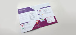
The direct mails go out once a quarter to promote events in the following quarter, historically these composites, had been different everytime and showed little brand consistency,
Moving these forward I decided the the style needed to be consistent but still be different for impact. I created them so it had one key colour that went throughout and then two supporting colours for differentiating between them. The colours were bold and impactful, to attract people to want to engage with them. Each one had a featured event, which we asked a industry leader to write an article to support, which was great added value to the customer and helped sales staff engage in conversation with protential new clients.
 |  |  |
|---|